Herding Cats Creative
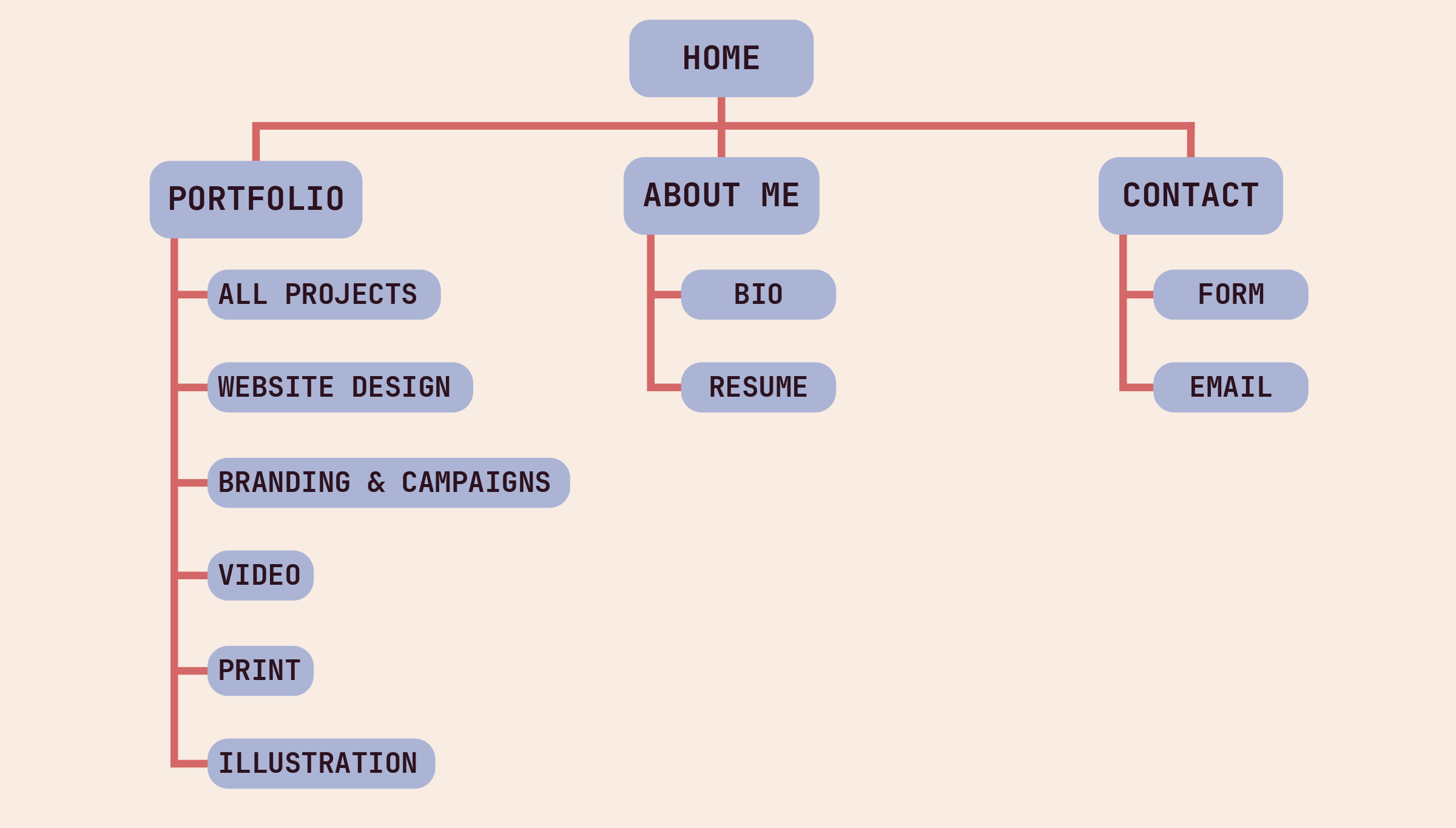
Website Design
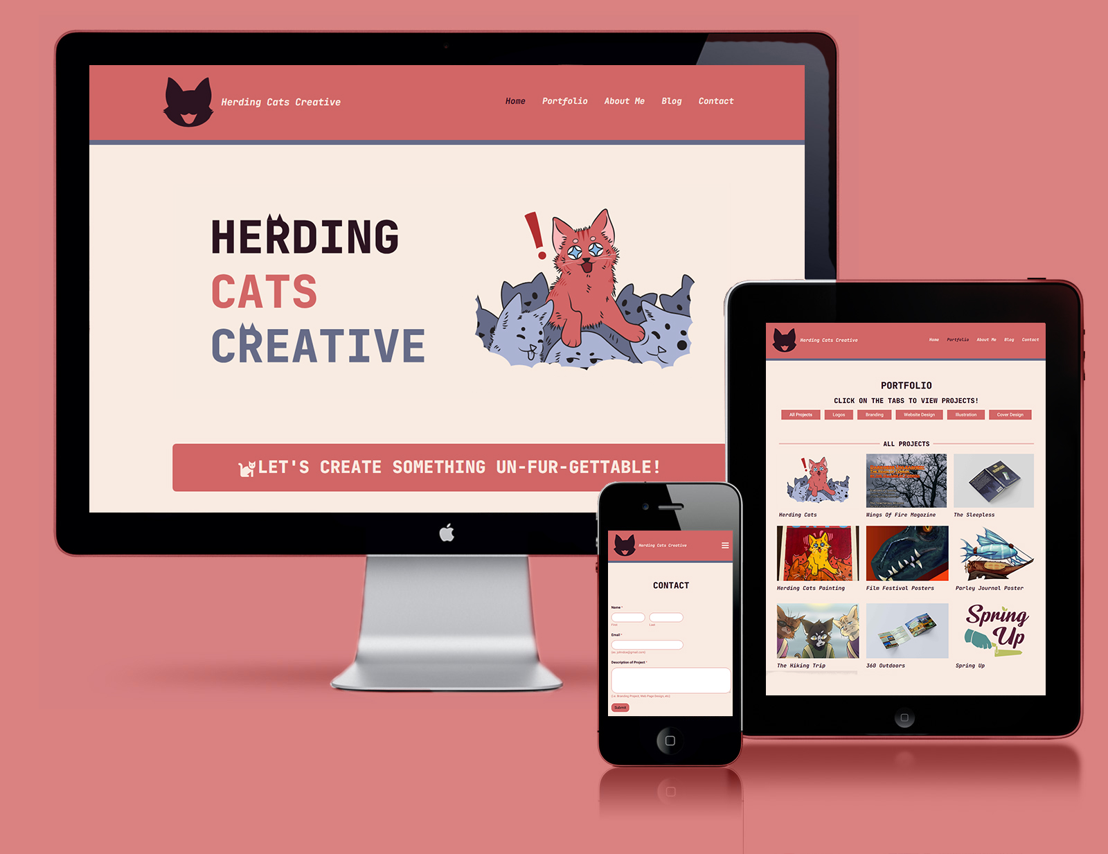
Herding Cats Creative is a personal portfolio site. As you may notice, it shares much of the same styles, colors, and taglines as seen on this site. Herding Cats Creative serves as the first iteration of my personal brand and portfolio website. It was created to be presentable to potential clients and employers, and was an opportunity for me to go all out with creating a memorable brand.
Herding Cats Creative and its hero illustration are based on a painting I made for an energy drink called “Herding Cats.” I chose this inspiration while creating this brand for a few reasons: my love of idioms, cats, and the energy and excitement the phrase entails (for the cats, that is!).
I believe Herding Cats Creative stands out as a brand that is simultaneously memorable, professional, and personable. While researching graphic design portfolios, I noticed a theme of mostly black and white dominated color palettes with a pop of color. To make sure this would be a portfolio that would stand out amongst that crowd, I went with a very bold color palette of reds and blues. I made sure even the darkest colors seen on the page are a dark red as opposed to black, and white is used sparingly for contrast.
Of course, something you can’t miss about Herding Cats Creative (or this site) is the cat puns. I think it’s important to showcase personality in a portfolio, seeing as it may be an employers first impression of you. The humorous taglines tie in well with the bright energetic color palette and fun visuals, while the clean layout and easy navigation keep the site looking professional and well made.

The logo of Herding Cats Creative is a cartoon illustration of a cats head, one that mimics the expression of the cat featured on the hero image. It is a simple logomark that relates directly to both Herding Cats Creative itself, as well as the main illustration. Given these similarities it is easily recognizable as the main logo of the brand.
The hero banner seen on the home page consists of both a custom illustration as well as a semi-custom typeface. The type itself is Jetbrains Mono, however with some added flair of the cat ears. The use of this font style only on the home page gives it the greatest contrast and makes the title stand out as the most important information on the site.
The illustration is a recreation of the original energy drink painting, done in Adobe Illustrator with the brand colors. It features a striking red cat leaping over a crowd of blue cats. This calls back to the brand goals of Herding Cats Creative of standing out amongst the crowd and creating excitement towards anyone visiting the site.
“Herding cats” is an idiom that means to attempt to control chaos. I believe much of the design process is attempting to control the chaos of a designers and/or clients ideas, especially when those ideas clash. At the end of the day, I think all graphic designers are experts in herding cats.
