The Sleepless
Book Cover Design
The Sleepless is a dystopian novel by Victor Manibo. It follows Sleepless journalist Jamie Vega on his investigation into the mysterious death of his boss Simon. Things go awry when he discovers he was the last person seen with Simon prior to his death, and as such the police suspect Jamie to be his killer. Unfortunately, Jamie also learns that his memory of that night is completely nonexistent, and it may have something to do with how he became Sleepless. The novel explores a capitalist society that no longer needs sleep to survive, and the consequences it brings.
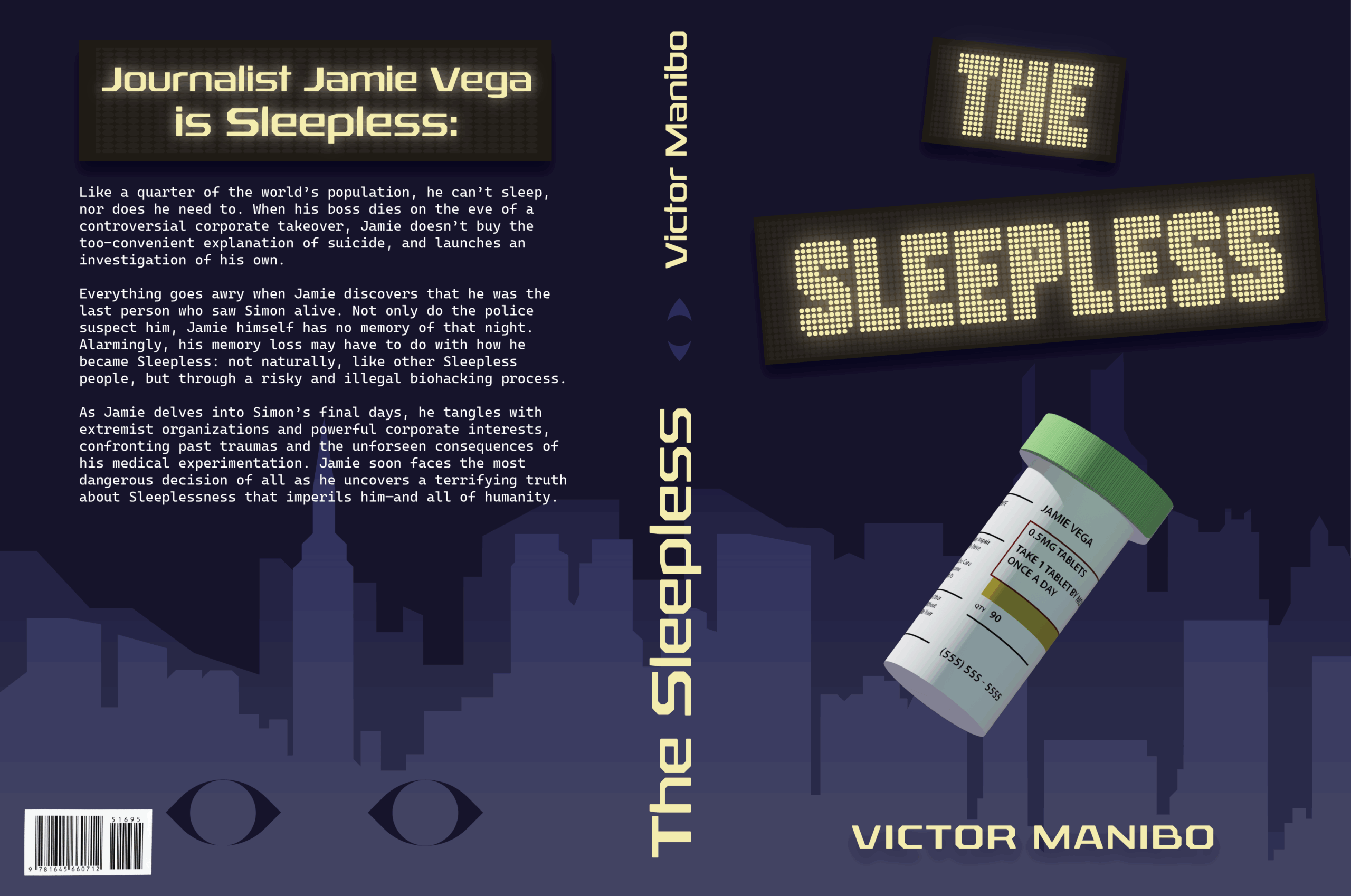
The original book cover features three pairs of eyes, each one getting progressively more “awake.” I kept the eye motif in my own cover, however in a way that reads more sneaky and undercover, seeing as for much of the novel Jamie is in hiding. The setting of the book is a not-so-distant future New York City, most notably at night. Given the nature of Sleeplessness, many more twenty-four hour businesses have emerged, and New York City is just as busy at night as it is during the day. I wanted to emphasize this point not only with the nighttime cityscape, but also with the LED sign-esque title. I wanted “The Sleepless” to look like a sign you’d see on one of the 24 hour bars that are visited in the novel.
The most notable section of this cover is the pill bottle in the center. Throughout the book the pills are another repeated motif. Simultaneously representing how Jamie became Sleepless and how Simon dies, and how these two plot points tie in together at the end of the novel.
With this cover redesign, my goal was to showcase more story elements than seen in the original. While I did choose the book off the shelf with the original cover, it was more so my interest in the title “The Sleepless” as opposed to the cover design itself. I wanted my cover to create questions in a viewers mind, “What are the pills for?”, or “What do the eyes mean?”. How do they answer these questions? By buying and reading the book.
I think it’s important for a book cover to showcase parts of the story without giving answers for the questions it creates. Creating curiosity for the story inside is the most important thing to aim for, seeing as it will determine if the novel gets put back on the shelf or if someone buys and reads it.
I aimed for a nighttime city color palette, consisting mostly of blues and purples except for the lettering. This creates good contrast and draws a viewers eyes to the most important pieces of text and the pill bottle, while also allowing for negative space around it all. The typography is meant to look futuristic without straying too far from more modern typefaces. The novel takes place in 2043, so there’s no flying cars or cities on the moon, but there are advanced pieces of technology that exist today in more basic forms.
The Sleepless is a dystopian novel, so an overall dark and depressing mood for the cover works to immediately make that clear. The skew on the title texts hints to something being disheveled, the lack of lights visible in the cityscape or stars in the sky make it less welcoming and more eerie.