360 Outdoors
Branding
360 Outdoors is a fair chase hunting brand located in Colorado. They put a heavy emphasis on being friendly and down-to-earth, and offer their services to both new and returning hunters. The goal of this branding was to create something welcoming and humble, as well as not fall in line with the other hunting brands located in Colorado.
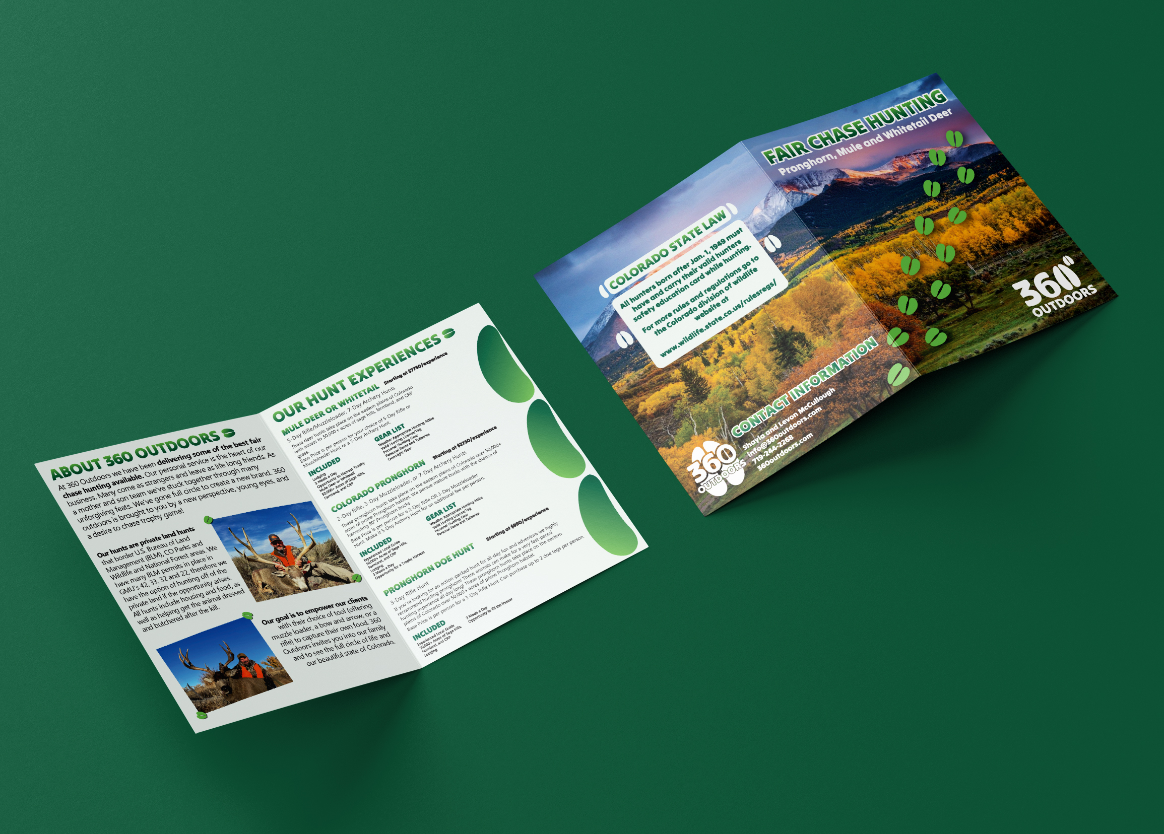
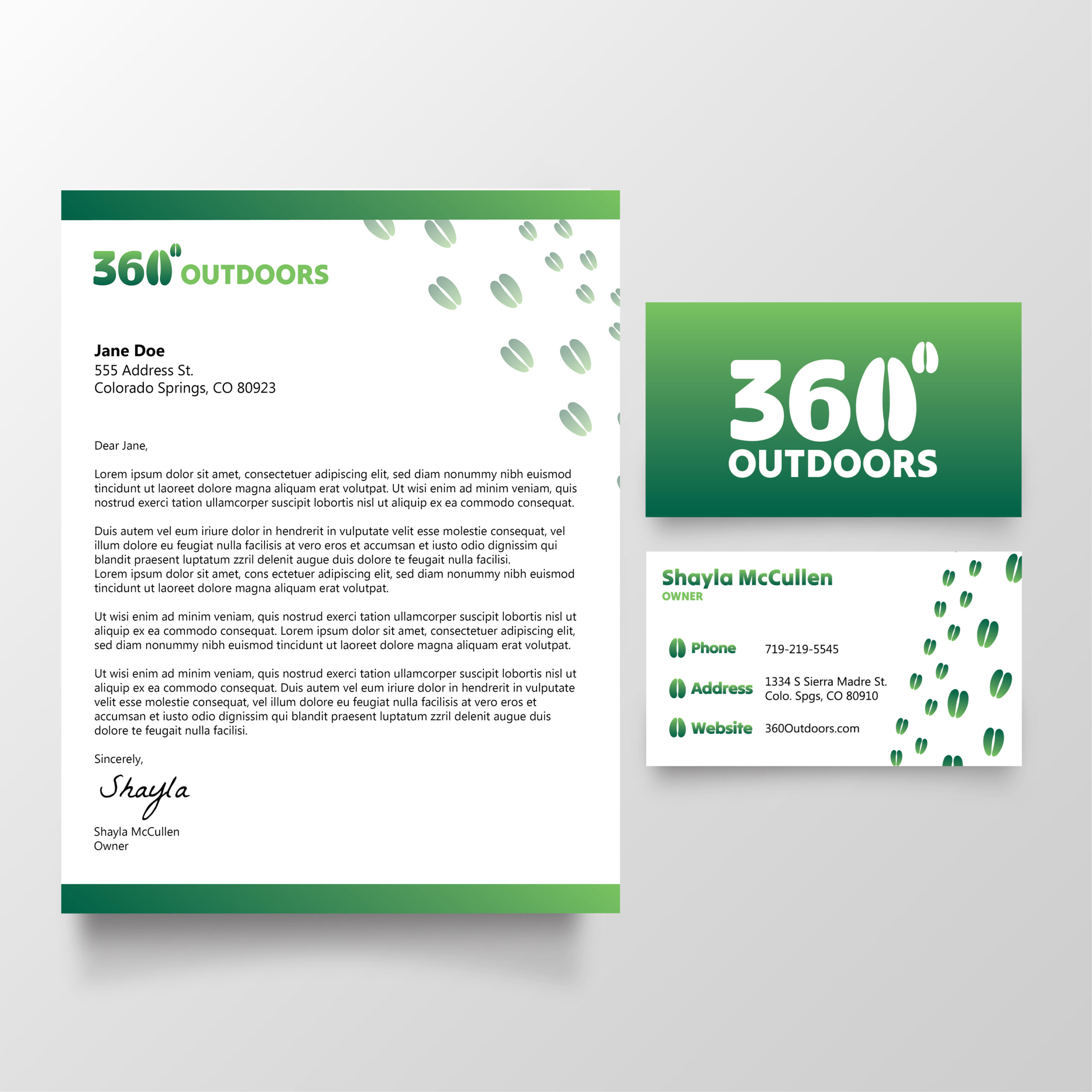
The logo I created for 360 Outdoors features two hoofprints. For the stacked and vertical logos, these pairs of hoofprints represent two things: the zero and degree symbol in 360 degrees, as well as representing the owners of the company, a mother and son duo. For the icon, the large hoofprint is made to look as though it is hugging the rest of the logo. I repeat the larger and smaller hoofprint pair throughout the brand collateral and brochure in order to keep calling back to the owners of 360 Outdoors and the logo itself.
The creators of the brand came from a troubled past, and they used their resilience to pull through, as a result much of the purpose of 360 Outdoors is to create a community where people feel safe and heard. Green is the main brand color in order to evoke feelings of safety, hope, and prosperity, and the type treatment for the logo softens the edges and makes it feel gentle.
Creating a hunting brand that is easily read as “for everyone,” was important to both myself and the client. In doing research, many of Colorado’s hunting brands feature rugged imagery such as rough outdoor terrain and wooded textures, and most often very clearly cater to a male audience. I wanted to stray away from this for 360 Outdoors, and created a brand that is neither overtly feminine or masculine.
The brochure for 360 Outdoors does a good job of bringing together brand pieces and colors, as well as in calling back to 360 Outdoors’s goals. As stated, I wanted to pull 360 Outdoors away from the rugged aesthetic seen elsewhere. I accomplished this by having the main photo featured on the cover be a vast, sweeping landscape. This landscape evokes feelings of freedom and tranquility, and the limited text makes it a nice area of negative space to enjoy. Given this treatment, anybody who enjoys the outdoors and hunting would definitely pick this brochure off the shelf or out of the mail pile.
The inside of the brochure features two images, both of which have a focus on a person who experienced a hunt with 360 Outdoors. I wanted 360 Outdoors as a brand to feel like an approachable friend or neighbor, and one that people cherish memories with. As a result, I used a hoofprint motif on the corners of the images to look as if they are placed in a scrapbook of memories.
Aside from that, given how much information was necessary in this brochure, I wanted to make sure it had a clean layout. The first page is dedicated to who 360 Outdoors is and their goals, while the second page showcases their hunt experiences and what you get out of them. It is a lot of information to skim, so I made sure each piece of information was given a different font and color or weight in order to increase the typographic contrast. As an added separator, I also included halves of hoofprints that subtly split each of the hunt experiences.