Spring Up
Website Design / Prototype
Spring Up is a gardening glove brand focused on providing people with designer gloves that are durable and made of quality materials. This was a collaborative project, so the SpringUp brand and brand identity are not wholly my own, however I did have a part in their creation and I finalized the brand’s logo design.
For this collaborative project, we all had to make a major part of the brand individually (i.e. one person did the collateral, another did packaging design, etc) and my task was to create Spring Up’s website prototype.
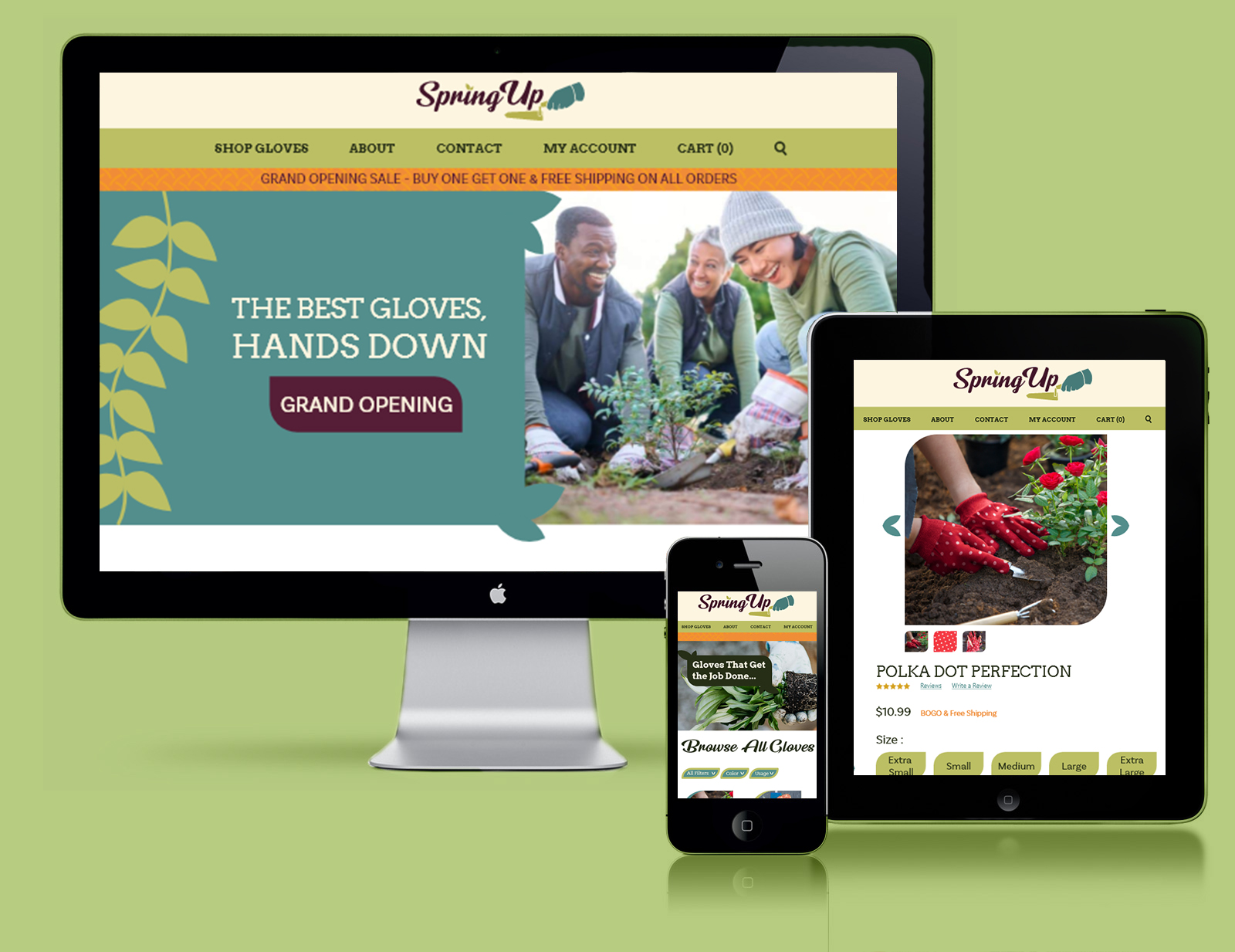
While Spring Up would sell their gloves in-store, e-commerce is their main method of getting products out. This means a majority of their traffic would come from customers using the site. Spring Up’s target and main audience is mostly older women, some of which may not be as tech savvy. As a result, it was important to create a website that not only has a strong brand identity that leaves a lasting impression, but also one that is accessible and easy to navigate. I accomplished this in one main way: following the conventions seen on other online shopping sites.
Buttons for filters such as sizing or color, a grid layout for items, product details and reviews are all things seen on a majority of online shopping sites, which means that a majority of people who have bought anything online know how to navigate them, even on new websites. Spring Up’s use of these conventions ensure that anyone of any age can quickly and easily view their products.
Imagery with a focus on people was used exclusively on the home page in order to attract a female crowd, who appreciate seeing how a product may affect them emotionally as opposed to just the product itself. On the shop pages, photos of the gloves in action are featured so that a customer can get a better idea of what they are buying.
Sales are a large part of online shopping sites and serve as a great way to draw in traffic and a good basis for marketing. For this prototype, I wanted to make sure I included how a sale would be handled, which is a striking orange banner under the main navigation bar on the home page. This would grab the viewers attention, and upon seeing “Sale” they would more than likely read what it says entirely. This orange bar could also be used for fundraising opportunities or events, making it versatile and reusable.
I intentionally designed the shop page and product page to not include the sale, I wanted to make sure they would shine even when no events are occurring. Their sale pages would share a similar orange bar, but would also include a more fitting hero image on the shop page that showcases one of the designs on sale, it’s price, as well as a button to filter only on sale items.
My goal for this prototype was to create a robust idea in as few pages as necessary. While the About, Contact, and Login page aren’t featured, given how fleshed out the home and main store page are its not hard to imagine what their layout would be. Similarly, the individual product page can essentially be copy-pasted to fit any of the glove designs, all you’d need to change are the pictures and information.