Under the radar
Website Design
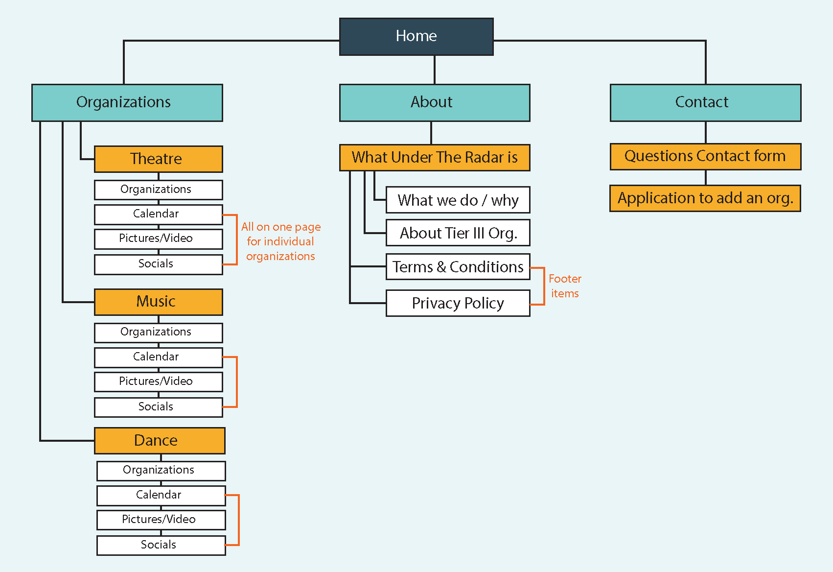
Under The Radar is a website dedicated to showcasing Tier III Performing Arts in the Denver area. This includes having information about organizations, links to their websites and social medias, photos and videos of their performances, as well as a calendar of upcoming shows.
Under The Radar was created as a rebrand for a previous site with a similar goal. The previous site was seeing low user interaction as well as little to no new users. The goal of this website design was to modernize the layout and create a site that would both welcome back users of the previous one and invite new users to “Explore, Share, and Support Denver’s Tier 3 Performing Arts.”
For the brand itself, I was going for an adventurous tone and feel. I wanted viewers to feel like they were exploring the intricate and diverse world of performing arts. The bright blues of the color scheme represent how vast and freeing performing arts are; in contrast the vibrant yellow and orange represent excitement and exploration. The calls to action and content of the site itself always include the words “explore” or “discover,” this calls back to the brand’s tone, as well as serving as an invitation to those reading it.
Given that Under The Radar’s target audience is anyone in the Denver area who enjoys the performing arts, it was important to keep the site easy to navigate. A limited filtering system, like narrowing down the type of performing art, as well as generally not having many main navigation pages (Home, Organizations, About, and Contact) keeps users from getting lost or frustrated because they can’t find a page. In the event someone is looking for a specific organization, a search bar is available for their convenience. Generally, my rule for this site was to keep it as simple as possible for the best readability and user experience.
“Under the radar” is an idiom that means to go unnoticed, for this brand specifically it relates to tier 3 performing arts often not getting enough attention or recognition. The phrase originally relates to aviation where flying “under the radar” meant flying below radar detection system ranges. Aviation is a means of transportation, and one most often taken when seeking new experiences or adventure. This double meaning calls back to the brand itself and is a building block of the larger brand identity.
For the logomark, it is a radar with two of the lines creating a stage light with a microphone. The radar part of the logomark directly relates to Under The Radar, whereas the microphone and stage relate to one of the brand goals of “shining light” on tier 3 performing arts. While not all performing arts use microphones, the icon itself immediately denotes the general performing arts, and the stage serves as a basis for all of them.
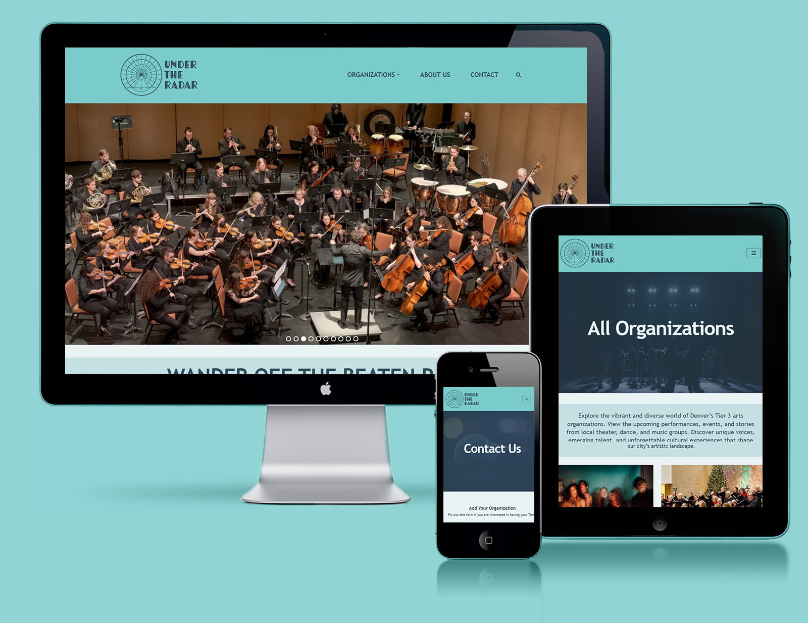
The end result of this site ended up differing quite a lot from its original wireframe in terms of layout. While building Under The Radar I realized that, while I did keep my wireframe simple and easy to navigate, it looked a little too simple. My main takeaway after looking at it for a while was that it looked almost like a site made for children, and as a result I needed to push for something more professional.
I accomplished this by making the headers for each page an image banner with a striking title, as opposed to an orange box. Instead of listing the organizations in a single-line accordion as seen in the wireframe, I gave them each a nice post box that hovers with a professional fade in animation.